We plan on creating a music video for the song 'End Credits' by Plan B featuring Chase & Status. We both share enthusiasm within the track and feel we can produce a successful music video due to the tempo of the song, and we immediately pictured this idea within our heads of a gritty east London production. The song is fairly fast paced so we will need to include a wide range of shots and from different angles to ensure we create an exciting and successful video.
We have pictured using a burst of clips to highlight the change of tempo within the song. This will consist of several clips building up faster and faster until a main introduction is caused. We have gathered several ideas throughout the thinking process and want our production to seem as realistic as possible. We intend on including several events causing danger and a threat to society.
We know and understand our limits and what is really capable, so we have assessed the options and want our music video to look professional and realistic. We also intend on including performance within the video as we feel it is important. We shall be cross cutting between the narrative and performer to highlight the main focuses and messages trying to be portrayed within the video.
Wednesday, 9 February 2011

Shot List



We use this point of view shot to place the viewer in the perspective of the protagonist, this enabled us to make the effects of the situation more apparent to the audience, this was achieved through the blurring of the headlights of the car reinforcing the dazed state which the protagonist was in.

The use of the extreme close up is effective in presenting the situation and lip syncing, the direct eye contact between the performer and the audience enables engagement.
Evaluation Activity 4

This image represents the use of the computer and editing program. Without these two elements we would not have been able to create and produce a music video. We used a program called I movie HD to produce the video, this enabled us to organize the clips, edit them and fit them in time with the soundtrack. Then we also used the internet to distribute it online so it could be viewed by the public. We uploaded the video to a website called vimeo.com, this is a similar website to youtube but was more lenient on the copyright laws.We used the web to research into existing music videos and we highlighted how our music could explore the typical conventions of a music video. We wanted to make sure the narrative fitted in with the genre of music so we viewed several music video within our genre.

Then we finalized our main idea and started to film. We chose to use our own camera as we felt it would be more appropriate for our production as the image quality was of a higher standard to the cameras supplied and we wanted the video to look as professorial as possible. We felt the camera made a big difference in comparison to the other productions produced as ours was more defined and clear. Once the digital camera enabled us to focus in on certain parts of the frame causing a more effective shot. We also blurred the background on a few shots included due to the capability of the camera to emphasize the main focus in the frame.

This is the iPod and speakers which were used on every scene, shot as we felt it was important for the characters to understand the pace of the song and it also made it easier for the performer within the production to sing along. This helped later on when editing as the performer had the right timing so there wasn't much hassle to fit the lip syncing to the soundtrack.
Tuesday, 8 February 2011
Thursday, 27 January 2011
Evaluation Activity 1

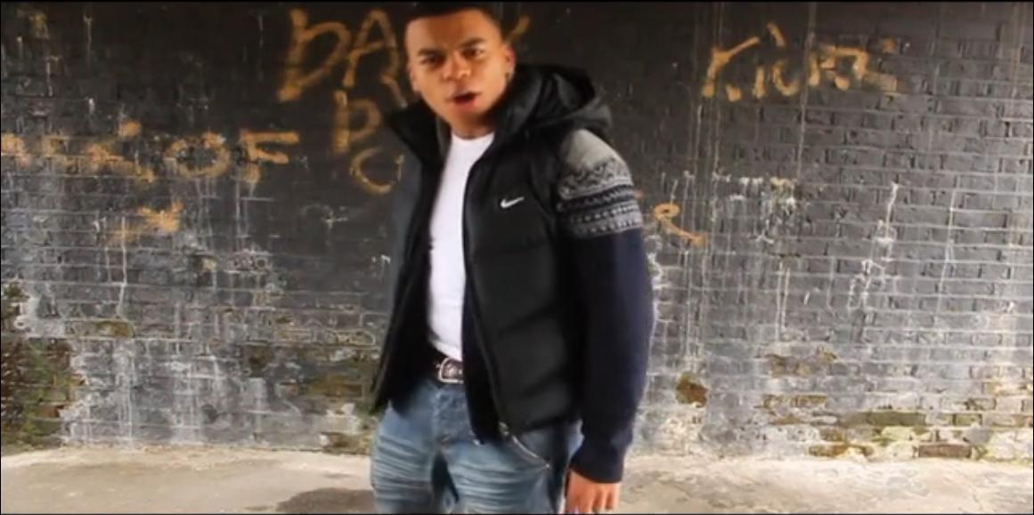
This is a shot of the performance. We included this shot to replicate the shot of the character within the production. We used the same composition to create consistency within the production. I feel it works well due to the lighting within the frame and also the close up so it creates a main focus on the performer.

Costume and Props were a vital part of this shot as it made it look realistic and believable. We wanted the situation to be as realistic as possible. So we carefully considered costume and the props used. This added more realism and fitted in within the location and lighting within the shot.

I feel this shot represents the music genre of the track due to the costumes used and the activity of the main character within the production. The Uk Grime genre is seen as stereotypically 'Ghetto' and 'troublesome' due to the relations to their real life within their songs.

The Location of this shot creates the whole urban style we tried to create. We wanted to achieve a gritty, east london feel to the production. This shot was taken in an underpass so we carefully thought about the location. The graffiti on the wall adds the urban feel as well as the moulded wall. A great location for performance.

We made sure we used a variety of shot within our production to engage the audience within the production. The image above is one shot of three we filmed of the two people approaching the main character. We wanted this scene to be fast paced so we included as many as many shots as possible.

I feel the camerawork within our production proved to be very effective. The still shot above is included in the fight scene at the end of our production. We wanted it to be as realistic as possible so we made sure the camerawork was spot on as we wanted it to be believable. It worked and made our production an success. The lighting within the opening shot and movement of the camera creates a very powerful opening and finish.

We did research several music videos within the genre of UK Grime, to gain an idea of what was expected and stereotypical features within the genre. We also viewed the actual video for the song we chose and admired some of the shots included. We found the close up was important and effective so we decided to include that feature within our production. It worked well as it created a main focus on the central of the narrative. It was definitely the right decision to shoot a close up of the character as the background of the muddy floor creates a powerful and creative image.

We used this shot to highlight the transfer of time. We deliberately chose this special effect. The monochrome shot was the only way we could represent the change in time. I feel the change in time was easily identifiable due to the effect used. It made the sequence of shots more effective and powerful.

Evaluation Activity 2

This is our analysis of our advertisement, we have broke down and analysed each feature detailing the effect which it has and how it is relevant to the song and music video. We used this font as we felt it reinforced the genre of our music video dictating the theme chosen being gritty and urban by having a white background this enables the title to stand out.The use of the black background is effective in making the features stand out, the black background incontrasts with the picture symbolises how the song goes against the norm.We have featured the release date, as this is a common convention of music video advertisements this is also a good way to directly address the viewer of the advert.We have inputted these stars into the advertisement as this reinforces the statement from NME. For the potential customers of the single at a glance the 5 stars could draw their sight. The use of NME adds realism to the advertisement, as NME would be a magazine likely to review the single. The image we have chosen features the performer from the music and the light trails resemble the obstacles which characters like the one in the music face in everyday life which can lead to their death hence the title of the song being End Credits.

1.We have chosen this picture as we felt that it conforms to the abstract nature of the music video. This picture is effective as both shows a scene of our music video and offers our interpretation of End Credits.
2.We chose to use this background as we felt it conformed to the abstract theme of our Digipak. The picture chosen shows light trailer which resemble the fast paced features which are seen in our music video production and also give reason for the character coming to his end credits. We chose to use the white font as this is a clear and easy way for the titles to stand out. The barcode as realism to the Digipak.
3.We have chosen to select this picture as a panel of our Digipak as we thought this incorporates and contributes towards the abstract theme we wanted to present with both our Digipak and with our actual music video.
4.We chose to use this background as we felt it conformed to the abstract theme of our Digipak. We chose to print the lyrics in white as we felt it is a clear way for the reader to look at the lyrics. We decided to feature the lyrics in our Digipak as this is a major way for the audience to connect with audience and enables them to visualise as if the artist or Band is singing alongside them.
5. We chose this as our Digipak cover as we felt this exhibits the nature of Digipak and our music video. By having the title in white this enables it to stand out against the abstract background. The use of the parental advisory sticker allows the audience to be aware of the explicit content and enables parents to be aware of the content which their children are listening to.
6.In order for the audience to connect with the music we have used this picture for the background. By displaying the information on the Digipak enables the audience to connect and relate to Benjamin Drew and understand him and how he came about to becoming Plan B. We used the black font for the information to stand out against the background.
Wednesday, 26 January 2011
Digipak

This is our final Digipak created from several different clips from the music video and also from locational shots. Our Digipak uses abstract images throughout. We wanted to create an urban vibe as it relates directly to the song. We did this by considering where exactly the images were taken and what type of effects we were to use in each picture.
We chose abstract images as we felt it represented an urban and east London lifestyle. The two cartoon like images included within the Digipak are our own interpretation of the main theme of the song 'End Credits', this title is implying the end to his life so we felt the images successfully portrayed the stages of his death within our music video.
We felt the location of each image was very important as it tells a part of the story and represents the artist. We chose to include information about the artist as we felt it was a typical feature of a Digipak but we also felt it was appropriate for the consumer to understand the artist further in order to really appreciate the song and the lyrics.
Overall the Digipak we created is a success, we feel due to the thought in the colour scheme and the appropriate information included. The colours included within each image match and the font used on each slide create a flow and consistency within the Digipak.
Scenes of our Digipak


Both of these above are the backgrounds of the CD holders, these contribute to the overall theme of the Digipak being abstract. We included these as this shows the scenes of our interpretation of End Credits.

We felt we should include the lyrics and this is a good way for the artist to directly appeal to his audience and gives the chance for his audience to sing along with him. This technique is assumed generally by bans and artists,

This is our front cover of the Digipak this explores and coincides with the abstract nature of our Digipak due to use of light trails and editing of the focus picture. We have impicted the performer in the music video as at stand still with the cars passing by symbolic of the challenges which are faced in the narrative by the protagonist,

This is the back cover of our Digipak we have maintained the theme of the Digipak being abstract, through the use of background in this case, we felt that light trails was a good way dictate and the support the fast paced music video matched with the interpretation of the song being something coming to an end, "End Credits".

This slide explores the rise of Paul Ballance Drew (Plan B) and where he has come from.We decided to choose this picture as we felt that this picture exposes how Plan B goes against the norm and exemplifies his lack of concern for the human condition which can be interpreted as to live for the moment.
End Credits Poster

This is our poster we feel this captures the atmosphere created in our music video, we have taken conventions from advertisement used to promote singles and albums, as you can see we have presented a brief comment from NME this adds realism to the the poster. We have also included the release date on the poster a common convention from most general advertisements, the content of the picture shows our artist in the video standing as cars go bye we have presented these as light trials symbolising how life is moving past him at a fast rate hence the fast paced music video. the font we have used to describe the poster is gritty and urban which reinforced the genre of our music video.
Friday, 21 January 2011
Advertisement Research
I have chosen this advertisement as I feel it highlights the typical codes and conventions of promotional adverts for an upcoming single. There are several features to this advertisement that stand out and make it easily identifiable. The colors used play a very important role within capturing the audiences eye. They have used bold and vibrant colors to capture the consumers eye. The use of the black background makes the main artist 'Tinchy Stryder' become the main focus of the advert/Poster. They have included promotional phrases to emphasize the release of the single/ terms such as 'Pre order now' and 'Txt Tinch to 78789'. The advert is color co-ordinated, this highlights a sense of organization and order. The matching of the clothing and accessories to the main color scheme creates an successful advert.


Thursday, 20 January 2011
Planning for Digipak

This is the back panel of the digipak, it shows the closing scene from the music video we felt this was an effective portrayal of the title theme 'End Credits' as it could be interpret that he is dying.

This is the front cover, we took into consideration the genre element from the music video by incorporating the protagonist from the music video.

This is the CD holding compartment

We included the lyrics from the song in the digipak as we thought it would be a good way to promote the song by people being able to sing a with it, this is a common feature of digpaks.

This is the second holding for a CD in the digipak in which extra content is included for example other songs and the music video.

This is the information panel from the digipak in which we produce information on Plan B and his history with music.
Advert Research
When we were looking to do our advert for our dvd aspect of the digipak we researched advertisement conventions from sources such as magazines, internet:-
- colour scheme to match the genre of your video
- images of the band/production
- eye catching image
- name of album/band
- reviews of the album
- short simple words to describe the album
Thursday, 13 January 2011
A2 Media Music Video
This is our final media production we created for the music video 'End Credits' by Plan B ft Chase & Status. We enjoyed producing this music video because we found we could create our own style of filming and editing. We feel the video was a success due to the use of location, character and props. We felt detail and location within each scene was important to make it realistic and believable. We felt this was one of the most important features. We also took in consideration the quality of the camera. This made a real difference within our production compared to others produced in our class it looked more professional.
Friday, 10 December 2010
Dimensions - Get Ahead OCR Analysis - The Vixens

- This is an example of a digipak taken from a students past project for media a level. I found this example by searching get ahead OCR in the google search engine. It then came up with a website then had several examples of digipak's. I chose this one as I felt it clearly demonstrates the typical codes and conventions of a Digipak.
- This digipak highlights several key factors that are normally included within this CD pack. This example uses a colour scheme to keep the consistency and flow between each section of the digipak.
- The images of the artists on the front and back cover is composed very well and looks professional. I feel costume plays an important role in there appeal to their audience, young girls.
- They have included the information of each song on the back cover and have positioned high heels mixed in with the text. I feel this works very well as it looks professional and original.
- The drawing aspect of the front cover is very good as it relates to a younger audience and plays with the young girl band era.
Analysis of Digipak

This is an example of a digipak from an artist called Myth. this digipak incorporates many typical digipak conventions, these conventions both conform and subvert to the genre of music he operates in.
- As you can see the price is labelled on the front of cover, this goes against normal conventions which normally position this on the back of the cover.
- The information of the artist is positioned in the middle of the digipak, next to a picture of the artist near the mouth insinuating that he is speaking the text.
- The song list is divided into its own section in the middle of the digipak where titles of songs are highlighted in orange colour, underneath this is a block of text describing the song.
- the use of colour is very effective as it highlights the name of the artist and represents the abstract nature of the genre he works within. The use of black and white used to dress the artist enables the title to stand out.
- This abstract nature of 'Myth' continues by the way in which he is impicted in photo of the middle of the digipak where he is giving the illusion that he is not sitting on anything.
Digipak Conventions

-The color scheme runs throughout this digipak. This creates a flow of order and is relevant to the pack of information. The contrast of the bright colors against the black creates a powerful image.
-The barcode is clearly evident within the package highlighting a typical convention of a digipak.
-They have included an image of performance which is in black white. I feel this image is powerful due to the comparison against the color scheme running throughout the pack.
- They have also continued a circular structure throughout each piece of the package. This shows consistency.
-They include visual imagery in terms of the designs on the front cover. It is more art based compared to a photograph due to the ideas and colors.
Wednesday, 20 October 2010
Friday, 8 October 2010
Research- The True Plan B
 Benjamin Paul Ballance Drew was born 22nd October 1983, little did he know that in 2010 he would be releasing an album called the Defamation of Strickland Banks which would reach number 1 in the UK album charts. Plan B grew up in Forest Gate with his mother and brother, growing up Plan B felt outcast from the rest of school pupils, Plan B taught himself how to play the guitar at 14, he had an interest in R&B and wrote and sang music of this genre but never felt comfortable to sing so he decided to launch in the direction of rap and hip-hop. B featured in songs by Roll Deep but finally released his his first album in 2006 'Who Needs Actions When You've Got Words'. The next year he featured with talents such Professor Green. Over the next couple of years he transitioned through the ranks of the UK charts with various releases but finally lead and meet his potential in 2010 with the release of Strickland Banks which completed his transition from hip-hop to R&B/ soul. Plan B was interviewed by USA Today and said "The whole reason for calling myself Plan B was that I was doing this sweet-boy Justin Timberlake [stuff], but I never felt comfortable... When I started rapping, it was easier for me to feel comfortable." The target audience for Plan B is R&B.
Presentation- The Vision
Within this video we present and explored our idea with our class, giving a short extract from the original video for End credits by Plan B ft Chase & Status. As stated in our presentation we picked this song as it offered us the opportunity to use the transitional nature of the song in both the lyrics and beat of the song. We conveyed our ideas and gave the sense of direction we want to go in with the song and narrative, incorporating the influences from the original video.
Thursday, 7 October 2010
Music Video Analysis
Mrs Officer - Lil Wayne
Mrs. Officer, a song by popular hip hop artist Lil Wayne is about a man meeting a very sexy woman that happens to be a cop and all of the things that this man does to this woman in a sexual way. The man and woman are playing a cop and robber type of game, but the woman is actually a cop. Lil Wayne is a long standing hip hop artist that is now starting to take over the hip hop charts, having many songs at number one. Hip hop is a type of music developed in the Bronx, in New York City in the 1970’s predominately among African Americans and Latinos (Wikipedia). It started off very popular in the urban and street lives of people all over.
This hip hop song is “rapped” by Lil Wayne and has a rhythm and blues section sung by Bobby Valentino. Rap stems from poetry and is a way that artists do not sing, but poetically state what they are trying to get out in the song. It is said as if someone is reciting poetry with a beat in the background that usually speeds up the words and provides a catchy tune for the audience. Bobby Valentino sings the chorus and adds flow to the song that catches people’s attention. The beat in the background slows to a more soulful beat, and speeds back up with harder and faster beats when Lil Wayne comes back in to rap. The video of this song is depicting an officer that pulls a man over for speeding. This officer is played by sex symbol type of woman. She is dressed in provocative cop clothing and proceeds to be sexual and flirtatious with this suspect.
Mrs. Officer, a song by popular hip hop artist Lil Wayne is about a man meeting a very sexy woman that happens to be a cop and all of the things that this man does to this woman in a sexual way. The man and woman are playing a cop and robber type of game, but the woman is actually a cop. Lil Wayne is a long standing hip hop artist that is now starting to take over the hip hop charts, having many songs at number one. Hip hop is a type of music developed in the Bronx, in New York City in the 1970’s predominately among African Americans and Latinos (Wikipedia). It started off very popular in the urban and street lives of people all over.
This hip hop song is “rapped” by Lil Wayne and has a rhythm and blues section sung by Bobby Valentino. Rap stems from poetry and is a way that artists do not sing, but poetically state what they are trying to get out in the song. It is said as if someone is reciting poetry with a beat in the background that usually speeds up the words and provides a catchy tune for the audience. Bobby Valentino sings the chorus and adds flow to the song that catches people’s attention. The beat in the background slows to a more soulful beat, and speeds back up with harder and faster beats when Lil Wayne comes back in to rap. The video of this song is depicting an officer that pulls a man over for speeding. This officer is played by sex symbol type of woman. She is dressed in provocative cop clothing and proceeds to be sexual and flirtatious with this suspect.
Subscribe to:
Posts (Atom)